How to set up your audio guide, walking tour, or museum app in three simple steps
Ready to bring ease, accessibility, and immersive content to your users? Don’t have a team full of data scientists or an endless programming budget? Perfect–getting custom content into your users’ hands with STQRY is as easy as starting a Google doc!
This step-by-step tutorial walks you through building your screens, mapping your groups, and building your brand. Follow along by logging in to your STQRY account or use a free trial to walk through the process and see how easy it can be to publish your own branded app.
Getting Started:
When you log in to your STQRY account, you’ll be greeted with your Projects Screen and be given the option to add a new project. This will be your home base, from which you can always view different projects and drafts.
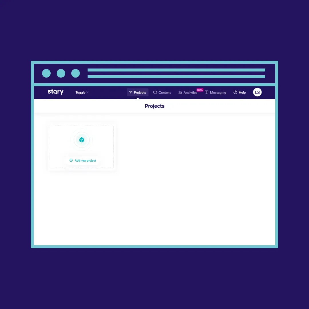
To set up a project, you’ll be prompted to add an App Name and Primary Language in the ‘Overview Tab.’ You’ll be given the choice to toggle more add-ons like a keypad, QR code scanner, or badge group, but these can be refigured later on.
Pressing ‘Save & Next’ will take you to the Tabs screen, which is where you’ll configure your global navigation buttons that will make up the menu at the bottom of your app and link to your content. We’ll return to the Tabs, Branding, and Submit segments of the Projects page once we’ve added some content. For now, navigate to the ‘Content’ screen at the top right of your screen.
Step One: Setting Up Screens
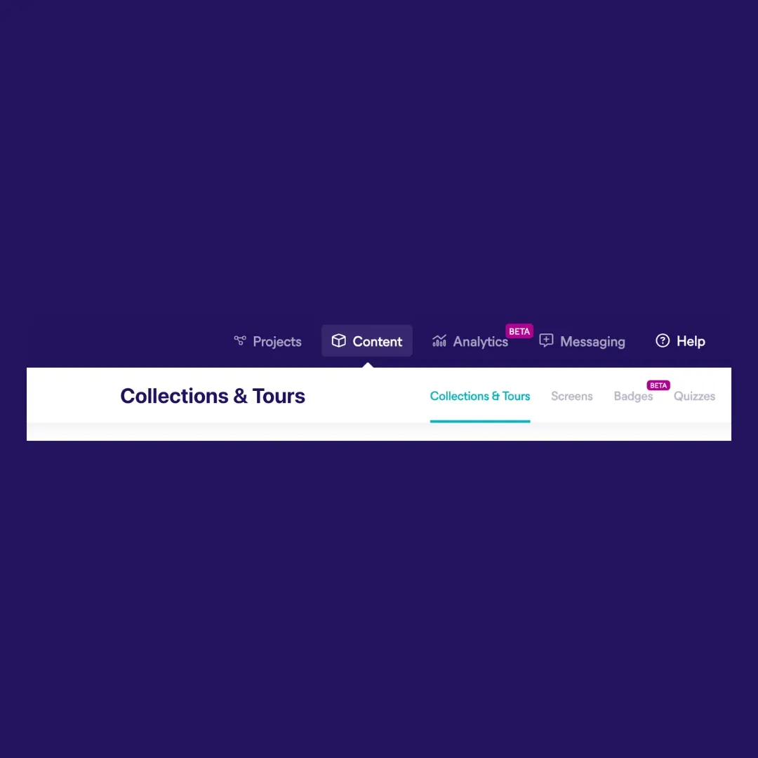
Navigating to the content tab, you’ll see the ‘Collections & Tours’ page open up with a tab menu consisting of Screens, Badges, Quizzes, and Media. Click on the second tab, ‘Screens.’ ‘Screens’ is the core of the app builder. You can think of a screen as a point of interest, a tour stop, or a page on your app–every piece of content should be a screen.
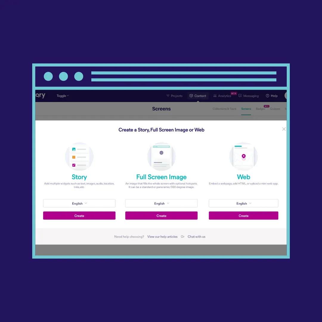
Clicking on ‘Add New Screen’ will give you three options: Story, Full Screen Image, or Web. Choosing ‘Story’ allows you to add multiple widgets like text, images, audio, locations, and links. This will comprise the majority of the content you have. Full-screen images allow you the option to upload standard or panoramic pictures with optional hot spots. The web option allows you to embed a webpage, which works well for adding a survey, donate page, or embedding another website page full screen. Add HTML or upload zip files to create a mini web app right into your content.
Building your First Story Screen
Choosing ‘Story’ will bring you to a Screen Details page where you can start to craft your content. First, add a title that helps you understand where this screen will be used. You can make it visitor-facing or come back to change it after you’re done. Next, you can choose whether you want the screen to have a header with an image and the title or whether you want to keep the layout header-free and add the image as a full-size image in the Screen Items section below.
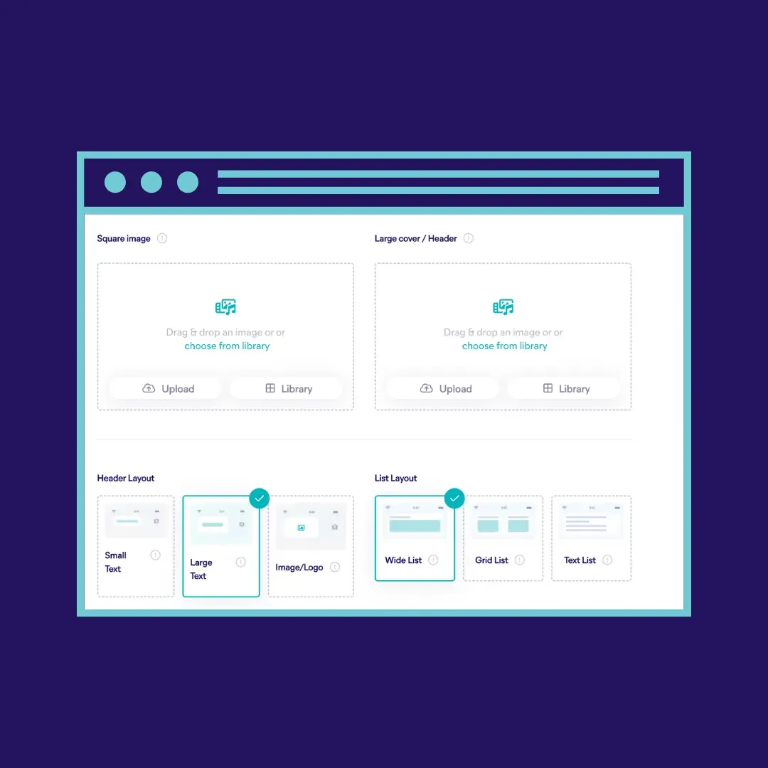
Under the header option, you’ll have space to upload an image from your computer or choose from any content you’ve added to your library in the Media tab. The large cover will be used for any wide screens and tour listing pages and requires an image with a 16x9 ratio. The square cover will be displayed in thumbnail lists, and you can use a 4:3 or 1:1 image. If you have app version 9.0.48 and above, you’ll also be able to upload a background image, which can add to the branded feel of your app.
Next, you’ll have an option to link a location to your screen. If you’re creating an outdoor tour or walking guide, you can search for an address in the search bar, drag the map pin right onto the map, or enter the exact latitude and longitude of your destination. If you’re not sure of the physical locations yet, you can always return to this step.
Adding a New Section
Pressing Save & Next on your screen will bring you to the next section, where you will add Screen Items (otherwise, your screen will be blank). Click on ‘New Section’ to see 13 exciting content options to choose from.
Each screen can have multiple sections. You might add a photo or two using the ‘Media Gallery’ option and layer that with an audio track with an extra block of text. Pick what’s right for the screen you’re working on. The short video below walks through the process of adding a few sections to a screen.
If you're building for a multi-lingual audience, STQRY makes adding additional languages easy. As you build your screens, you'll have two options: you can upload translated content, or you can use our built-in Google Translate feature to adapt the content you have into 55+ other languages. You can read more about multi-lingual support here.
Repeat this process to build another screen with its own content sections. You’ve just created and designed two new stops or app segments for your visitors to engage with! This is where the magic of your destination experience will come together. Take the time with your team to get creative and add as many screens as you can imagine.
Step Two: Organizing Screens into Collections & Tours
Now you have all the points of interest mapped out into screens with some content uploaded (that you can always return to and tweak). How will you guide your visitors through them? Will they all be part of one tour or multiple? Do you want your visitors to go through them sequentially or be able to choose their next screen from a list? This is where the Collections & Tours part of the builder comes in.
When you’ve saved your screens, press again on the upper right-hand tab that says ‘Content’, and you’ll return to the first page, Collections & Tours. This is where you’ll make those organizational decisions–like an architect building the path for your users to walk through your app experience.
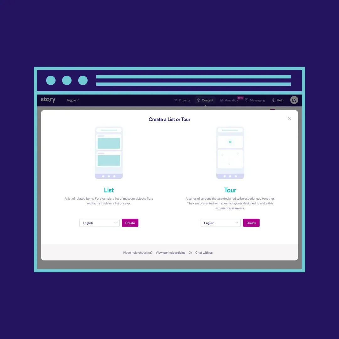
Clicking ‘Add New Tour or List’ will present you with both options, and you’ll start with ‘Tours’ before ‘Lists.’ Lists are used to create layers within your app or for a listing of your Screens. When multiple tours are created, you can link related tours together for easy visitor navigation. For now, you’ll choose the ‘Tours’ option to put the screens you just made into the proper sequence that will make up a tour.
Here again, you’ll have an option to add a title and introduction. You’ll be able to name your tour type, which will determine the icon that appears in the tour overview. The settings allow you to choose your initial layout–whether you want your users to view the screen's content first or the map associated with the stop at the top of their screen. You’ll also select the tour mode to indicate whether the navigation is user-dependent, triggered by location, or designed to autoplay the media that follows. Additional options for configuring Autoplay are available below.
STQRY’s builder offers tons of customized tour configuration options, such as grade, duration, and distance, and allows you to upload cover images, audio previews, and other options like keypads and QR scanners based on what each specific tour needs. You can configure all the options at this stage or return to this screen when you’ve solidified the rest of your tour experience–and you can always leave an option blank if you don’t need to include it.
Adding Your Screens to Your Tour
Clicking ‘Save & Next’ on your tour configuration brings you to an easy interface where you’ll add the screens you just created as stops on your tour. Click ‘Screen’ to add one of the sections you’ve already made, or ‘Create New’ if you’re inspired to return to the Screen stage and build some new content. Click and drag to reorder the stops, and check out your map to see, edit, or add new location markers for each stop. Here you can set up geofence options, create polylines, and import routes. Other options include adding a custom or georeferenced map.
Congratulations – you have yourself a tour! Repeat the process as many times as you need.
Adding Tours to a List
When you have one tour or more, you can add the tours to a list by returning to the Collections & Tours page, clicking ‘Add new tour or list’ and selecting ‘List.’ You’ll follow a similar process to title your list, add any introduction, choose between a content or map-first view, and organize your group of tours in an arranged order, alphabetical order, or by distance from wherever the user is.
Pressing Save & Next will allow you to design your list page with options for your header layout, list layout, large cover image, and square image that will be displayed in any list grid.
Step Three: Linking Your Content In Projects
With your content organized into screens, your screens arranged in tours, and your tours grouped in lists, you can return to that first project screen and finish your setup. Use the upper navigation panel to return to your Projects screen and select the project you’ve been working on.
Switch to ‘Tabs’ to link the content you just added to your global navigation menu. Beside Project Tabs, click ‘New Tab’ and add your list (you might start with the home page list). You can click on the icon to change it and edit the title to show up in the menu as you’d like it. In the tabs section, you can also link an info screen, embed a web page, and add anything else you want to be easily accessible with up to five buttons.
Note: at any point in the builder experience, you can click on the chatbot at the bottom right corner of your screen, and our team will help you with anything you need. One thing we love to do for our customers is offer a preview of their app before they’re ready to launch. Use our chatbot feature to get in touch; we’ll gladly help you with that. Reach out for a full launch preview, or ask for one of our customer success associates to walk you through any part of the process.
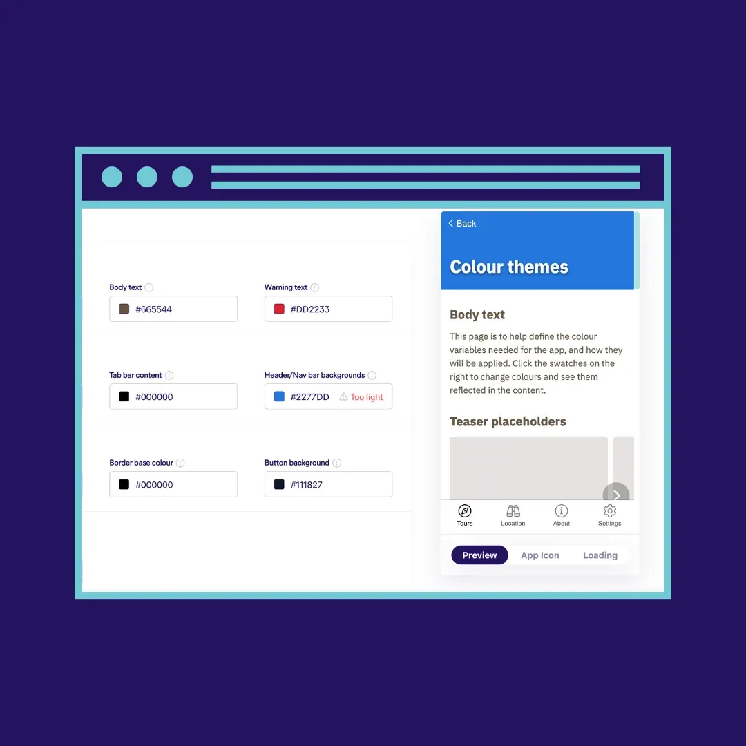
With your navigation set up, now is a great time to return to your branding screen and add the final touches that will make your app feel like an extension of your online and in-person experience. Add your brand colors by Hex Color Codes, or use the slider to pick shades you like.
Preparing to Submit
On the submit section of the project page, you’ll have space to input market details and pricing information. This will prepare your app for launch on the Apple Store and Google Play. Here, you’ll add translation details, add QR codes, and charge for or lock any content in the app.
STQRY was designed to make content design simple, and we’re here to help you bring any kind of content you can dream of to life through an app. Get in touch with our team for help with your setup, or try STQRY builder for free and build your best stories in three easy steps!