How do you build a mobile app that will inform and educate visitors, keep them safe, and achieve organizational goals?
Fortunately, other organizations have pioneered the way forward.
In one of our 2022 STQRY Summit Sessions, we sat down with digital leaders from both Parks Canada and the US Forest Service to find out how they’ve created mobile apps that satisfy different initiatives—all while serving visitors across hundreds of parks.
Here are some important lessons learned that will help you on your own digitalization journey, regardless of what stage you’re in.
Mobile App Lessons from Parks Canada
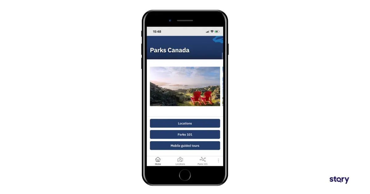
Parks Canada had been offering some form of location-based tour guide app content since 2008. But when the pandemic sparked a massive increase in the desire for self-guided experiences on users’ own devices, they decided to find a better platform that would allow them to spend more time creating content, and less time coding.
Parks Canada decided to rebuild their app using STQRY Apps. Here are some key takeaways from the implementation.

1. Set requirements before choosing an app-building platform
It’s important to clarify your requirements before you lock in a platform. This way, you’ll choose something that is future-ready and can grow with you.
Parks Canada’s main requirements include:
- Focus on content over code
- Whitelabel solution
- Meet English and French language requirements
- Meet accessibility requirements
- No privacy or security risks
We wanted to seek a new platform that would allow us to focus on the development of new content over code.
Valérie Chartrand, Senior New Media Analyst with Parks Canada
2. Determine what makes a great guided tour
It’s important to also clarify and communicate what makes a great guided tour—it’s sort of like setting requirements for your content.
What makes a good guided tour? It allows visitors to discover the history of a park or historic site in an interesting and engaging manner through the use of audio, video, text, photos, and maps. It’s accessible, and free from barriers of use for all visitors. It reveals details of elements along the tour that visitors would not have encountered without the app. The information shared adds a deeper meaning and significance to visitors’ experience of a place.
Valérie Chartrand, Senior New Media Analyst with Parks Canada
3. Setup the internal team structure and support for creating content
Parks Canada manages and protects 174 national historic sites, 47 national parks, 5 marine conservation areas, and one urban park.
Needless to say, that’s a lot of content.
In order to support the creation of content, they setup a smart work structure. Technical guidance is managed by the New Media team, while content guidance is provided by the Visitor Experience team.
Field units across the country create their own audio, video, and image content with the support of these teams. That support includes a confluence site for discovering best practices and getting questions answered.
4. Create project phases for implementing your no-code platform
Parks Canada and STQRY worked together to phase the rollout of STQRY no-code app builder.
The first phase consisted of transferring all existing tours to STQRY and creating new tours (10 have already been launched, 15 are underway). The second phase—currently in progress—is to pilot a national app portal approach similar to that of the US Forest Service, and enhance tour guide content with all necessary park information, links to booking reservations, and more.
Mobile App Lessons from the US Forest Service
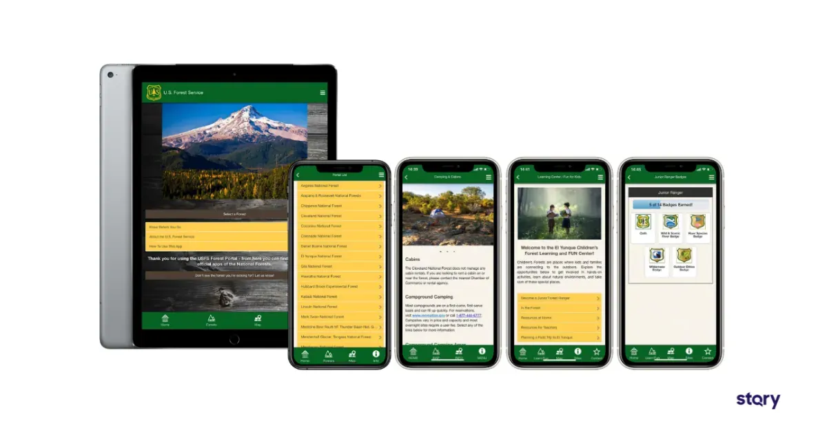
The US Forest Service’s National Forest Explorer App was built on STQRY over 6 years ago. It offers all sites and necessary information under one app. Each forest destination can be downloaded individually for offline consumption.
Here are some great lessons we can all learn from their app.

1. Set core goals for your app
Make sure to set a few core goals for your app. Set goals ahead based on the visitor experience you want to provide or issues you want to solve. This will help get all collaborators and stakeholders on the same page, ensure that your work is focused and productive, and help you determine the right UX and menu items for your app.
Here are the US Forest Service’s goals:
- Information
- Education
- Wayfinding
- Safety
2. Use multiple strategies to improve wayfinding and safety
You can use multiple strategies to achieve all of your app goals, but we’d like to focus on wayfinding and safety for a moment. And that’s because the US Forest Service made some smart moves.
They use STQRY’s location-based triggers to notify visitors of unsafe spots, such as slippery waterfallys, and to help keep visitors on the right path. Notifications can also alert visitors of image galleries, videos, and audio files that will deepen their experience. And visitors can sign up for their favorite sites to stay informed about closures and events at all times.
There are guided tours, as well as maps with various stops so visitors can chart their own path.
I have no doubt that the alerts and the app have helped reach users and save lives on the trails, as well as tens of thousands of taxpayer dollars.
3. Streamline functionality across all sites
One big takeaway from their National Explorer App is to create consistency across sites for essential information and features.
Each field site team is in charge of making their own tour guide content, and they can use whatever multimedia sources or tour categories they’d like. For the educational content, this provides a bespoke uniqueness for each site. However, every site has a “Know Before You Go” page to inform visitors of hiking, campaign, wildlife, and various safety tips.
This makes it easy for visitors to always know how to locate essential information, across sites.
Our mobile app usage always increases during the summer, and much of that usage is focused on the fire information pages.
Jennifer Becar, CIG, Public Affairs Specialist, Nez Perce-Clearwater National Forests
One of the strengths of STQRY has been that our field staff has had the ability to communicate directly with STQRY to ask them for specific functionality. Our field helped develop the functionality that is now available for all forest service units to have on their app.
Toby Bloom, National Program Manager for Travel, Tourism, and Interpretation, US Forest Service
4. Add gamification to your educational content (especially for kids)
Another great takeaway from the US Forest Service app is how they utilize gamification to reach their education goals.
Anyone who’s visited a national park with kids in toe knows that many sites have fun games and programs for kids, such as becoming a junior park ranger by completing a scavenger hunt.
With the app, sites can digitize their child education programs. Some sites have added their scavenger hunts, quizzes, badges and even augmented reality experiences.
The ultimate lesson? When you don’t have to worry about the coding part of the app, you can devote more resources to the strategy and content.
Watch all of our 2022 STQRY Summit Sessions, including Interpretation Reinvented: How the US Forest Service and Parks Canada are tackling outdoor interpretation in a digital age.