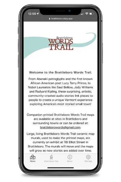
Brattleboro App
When you offer visitors a tour right from their mobile phones, you increase convenience and deepen the visitor experience all at the same time. But of course, if you create a mobile tour app, you want it to feel like a natural extension of the overall experience. The app needs to match not only your organization’s branding but the tours, exhibits, or sites that you have to offer.
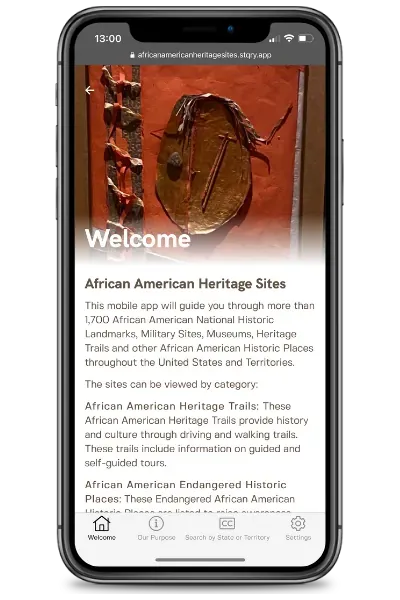
African American Heritage Sites App
If you use a mobile tour app builder like STQRY, you don’t have to build an app from scratch. Instead, you only need to customize it with your own content. This saves you time and money on development and maintenance. Plus, it ensures that your app will have great UX, because a team of developers has given a lot of thought to the layouts and functionality. At STQRY, we offer a few different layout options, all of which are super simple for visitors to follow along and engage with.
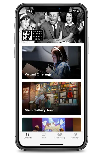
Walt Disney Family Museum App
In this guide, we explore how to customize your mobile tour guide app so it enhances the visitor experience while helping you achieve your strategic goals.
1. Brand the app to match your organization
First, you’ll want to customize the branding of your app. You can add a header image to the homepage and update the button color that will be used across the app.
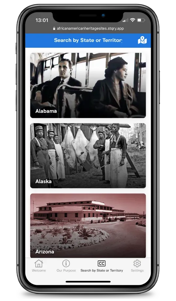
African American Heritage Sites App
Simply by choosing the main color and adding your own on-brand imagery, the app will instantly match your organization like this example from Brattleboro, Vermont. However, you can also have someone on your team use custom CSS and HTML styling if you want to take things to the next level.
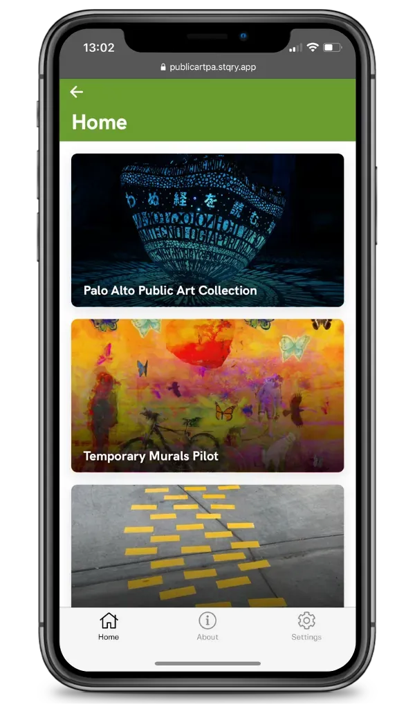
City of Palo Alto Public Art App
2. Create the perfect homepage
The homepage is one of the most important elements of your app. This is where app users will first encounter your content. You can use the homepage to welcome them and give them a brief introduction to your organization. African American Heritage Sites uses its homepage to introduce visitors to the different categories of content included in the app.
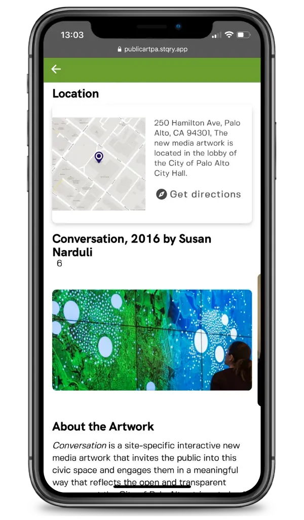
Artist page, City of Palo Alto Public Art App
The Walt Disney Family Museum, on the other hand, uses their homepage to guide visitors straight to the different content on offer. The homepage links to:
- Virtual offerings
- Main gallery tour
- Accessibility (audio and ASL content)
- Top ten things to visit
Meanwhile, the app for Snoop’s Walk of Fame encourages visitors to start the tour directly from the homepage.
To design your app homepage, consider the most important information or experiences that you want to offer. If you have a single tour, you can send visitors straight to it, but if you offer multiple tours, then you’ll want to use the homepage to present those options.
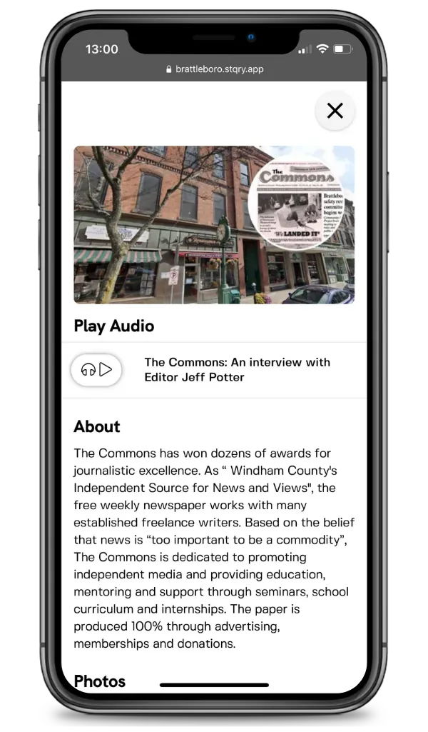
Downtown Tour, Brattleboro App
3. Make a list of tours, sites, or objects for easy navigation
Regardless of how you organize your homepage, it’s smart to have at least one list in your bottom navigation. For example, in the app for the African American Heritage Sites, there is a button in the lower navigation menu called “Search by State or Territory.” This offers a list of states with sites. From there, users can click to view sites within each state, and then click the content for each site.
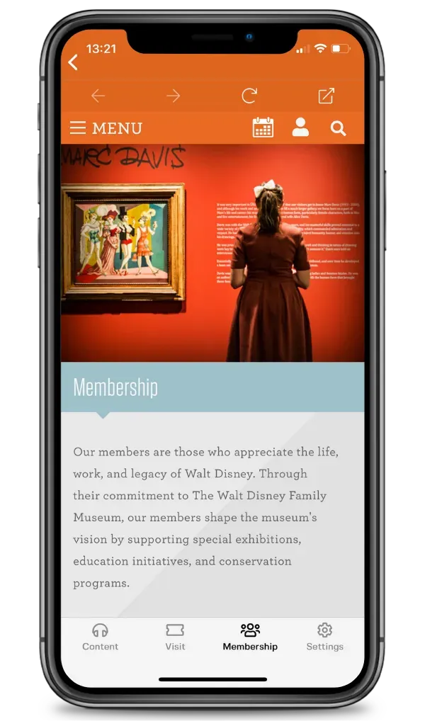
Membership Page, Walt Disney Family Museum
If you have only one tour, then you could add that to the bottom navigation and call it “Tour” or the specific name of the tour or trail. But if you offer multiple experiences, then you might want to create a list of them and call it “Tours,” “Experiences,” “Content,” “Objects,” “Artwork,” or something similar.
By creating a list, you can help visitors jump straight into the different experiences, while the homepage can offer introductory information.
4. Add text, audio, and or video content to each page
What really makes your app special is the multimedia content that you add to it.
Here are some different elements that you can add to various pages:
- Videos
- Audio tracks
- Text with headings, paragraphs, and bullet points
- Maps
- Images
The City of Palo Alto, California has an app for its public art. Many of the art pages feature multiple types of content.
This single page includes a map showing where the art piece is located, information about the artwork and artist, a video about the meaning of the art, a photo of someone viewing it, and a link to submit a photo for inclusion in the interactive art piece.
Brattleboro’s app features a tour of downtown. For each stop, there are multiple photographs, a text description, and an audio track.
What sorts of content do you want to offer to your visitors? Keep in mind that you can prioritize important features and objects to include video or audio content. While less important features might only have text and imagery.
5. Setup the main menu according to your goals
You can achieve a lot with a mobile app. Not only will you keep visitors happy and coming back for more, but you can also use the app to further strategic initiatives within your organization. For example, the Walt Disney Family Museum has added their membership page to the bottom menu navigation so that visitors can easily find it at any time.
On any given day, you might have dozens or hundreds of people visiting your app. What action do you want them to take after they’ve engaged with your content? Do you want them to sign up for your membership, donate, buy a season pass, purchase a ticket for a different experience, book a reservation with a restaurant in your district?
To simplify the bottom menu navigation, we recommend having a maximum of 5 items including the settings. Choose the items wisely in order to maximize the ROI of your app.
The layout of your app should be clean and simple, so that your content shines through. Customizing your app requires branding it to your organization and structuring it in a way that makes sense for visitors, and allows them to easily navigate through your content.