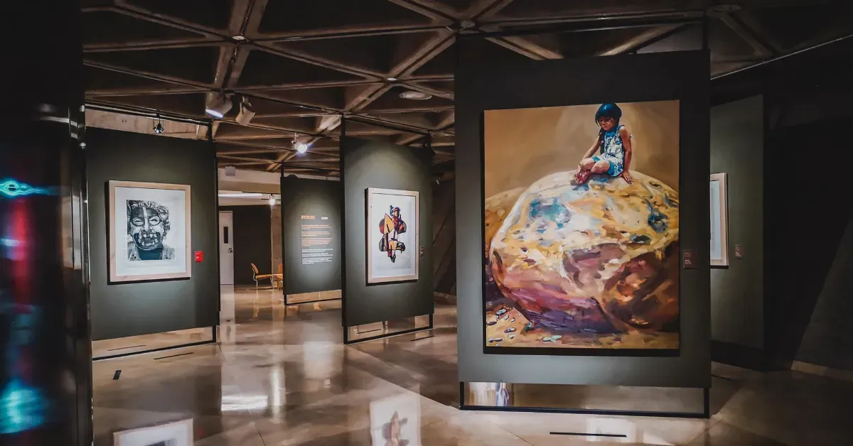
Have you ever wandered through a museum feeling completely lost? You're staring at beautiful artifacts or stunning artwork, but without context, they're just mysterious objects behind glass. That's exactly where museum labels come to the rescue.
Great museum labels don't just inform. Rather, they transform silent displays into compelling stories that stick with you long after you've left the building.
Here's everything you need to know about creating labels that truly connect with visitors.
What Is a Museum Label?
A museum label is the small text panel next to an exhibit item, usually listing the creator’s name, title, date, and materials. It also provides context that explains the object’s significance, background, or techniques.
Museum labeling dates back to around 530 BCE, when Ennigaldi-Nanna’s museum used the first known labels to identify artifacts for visitors. This early example shows that people have always relied on guidance to better understand cultural objects and works of art.
Why Museum Labels Matter
Engaging museum labels are powerful tools that transform casual observation into memorable experiences by creating emotional connections.
When visitors read labels that spark curiosity and match their interests, they form a stronger connection with the artwork or artifacts.
Moreover, museum labels help decode cultural context, highlight historical significance, and reveal artistic techniques that might otherwise remain unnoticed.
Well-crafted labels also democratize knowledge by breaking down complex ideas into clear, accessible language.
For example, a label might explain Monet’s Water Lilies by comparing his use of light and color to the way sunlight changes a garden during the day. This helps visitors easily understand his technique.
Anatomy of a Great Museum Label
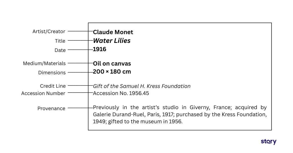
A strong museum label blends essential facts with engaging context so visitors can quickly understand and connect with the object on display. The key components include:

- Artist/Creator: The name of the person or group that made the object.
- Title: The name of the work, often in bold or italics. If there is no formal title, a descriptive one may be used.
- Date: When the object was created. This can be a specific year, a range, or an approximation (e.g., "circa 1876").
- Medium/Materials: A list of the materials used (e.g., "oil on canvas," "porcelain," "carved wood").
- Dimensions: The size of the object (height x width x depth).
- Credit Line: Acknowledgement of the collection that owns the object and how it was acquired (e.g., "Gift of John and Jane Doe," "Museum purchase").
- Accession Number: A unique identification number assigned by the museum for record-keeping.
- Provenance: Tells the story of the object’s journey through owners, locations, or historical events
The most effective labels balance accuracy with clarity, offering just enough detail to spark curiosity without overwhelming the visitor.
Levels of Labeling Museum Exhibits
Museums employ different labeling strategies depending on the scope and complexity of their exhibitions.
Object Labels (Artifact-Specific)
Object labels describe a single artifact or artwork. They usually include the creator’s name, title, date, materials, and a short explanation of why the piece matters or how it was used. These labels give visitors a clear way to connect with one object at a time.
Section or Thematic Labels
Section or thematic labels explain bigger ideas that link several objects together. They highlight themes, historical periods, or artistic movements so visitors can see how different items fit into the same story.
Introductory 'Overview' Labels or Panels
Overview labels or panels introduce an entire gallery or exhibition. They set the stage by outlining the main ideas, time period, or cultural background, helping visitors understand the bigger picture before diving into individual pieces.
Best Practices in Writing and Designing Museum Labels
A good museum label makes it easy for visitors to understand and engage with an object. Here are some of the key principles to consider:
Write with Clarity and Connection
Effective museum label writing starts with clarity and avoids heavy academic jargon. Using a conversational tone makes the subject feel approachable rather than intimidating.
From there, adding narrative storytelling can draw visitors in even more, connecting them through human stories, cultural meaning, or even parallels to everyday life.
Keeping the visitor’s perspective in mind is just as important. Instead of saying, “This vase demonstrates advanced ceramic techniques,” you could write, “Notice how the artist created these intricate patterns by layering different types of clay.”
This kind of phrasing invites people to look closer and discover details for themselves, turning a simple label into a more engaging experience.
Design for Readability and Accessibility
Great label design makes information clear, approachable, and enjoyable to read. A few core principles help ensure both effectiveness and accessibility:
- Readable fonts: Use type at least 18–20 points so visitors of all ages and abilities can comfortably engage.
- Visual hierarchy: Guide the eye with clear headings, subheadings, and body text that create a logical flow.
- Legibility: Maintain consistent spacing and strong contrast between text and background to support quick reading.
- Accessibility: Incorporate larger fonts, alternative formats, and inclusive layouts so every visitor can connect with the content.
When these elements come together, labels welcome people in and enhance the overall museum experience.
Position Labels Strategically
Display factors play a major role in how effective labels are. Start by considering whether physical or digital formats best match your exhibition goals and visitor flow.
Once the format is chosen, place labels where they’re easy to see without blocking the artwork or causing crowding that disrupts the experience.
Don’t forget to place the labels at a consistent, comfortable height (around 40-50 inches from the floor) so most people can read them without bending down.
Leverage Technology for Engagement
Technology makes it possible to tell stories in ways that static labels can’t. Digital labels, kiosks, and mobile apps let museums share different layers of information that match each visitor’s interests and learning style.
STQRY Kiosk represents a cutting-edge solution for museums seeking to enhance visitor engagement through technology. It allows institutions to upload multimedia content such as videos, audio guides, and even interactive quizzes that bring exhibits to life in new ways.
Just as importantly, STQRY Kiosk makes exhibitions more inclusive for all visitors. It supports multiple languages for international audiences, provides voice-over features for people with vision impairments, and can be paired with braille for greater accessibility.
For example, Ring's Redoubt, a historic fort from the New Zealand Wars, is the focus of an interactive exhibit at the Papakura Museum in Auckland. Through STQRY Kiosk, visitors can explore a large digital display showcasing around 6,000 artifacts connected to the redoubt.
This immersive experience helps visitors connect with the site’s history in ways traditional exhibits cannot.
Audit and Update Regularly
Regular auditing and updating keep label content aligned with new research, acquisitions, or evolving exhibition themes.
Without this upkeep, outdated information can undermine visitor trust and weaken educational value. This is why a systematic review process is essential for accuracy and relevance.
Use Visitor Feedback
Visitor feedback is one of the best ways to tell if labels are working. You can gather it through surveys, focus groups, or by watching how people interact with exhibits.
The feedback helps you improve the wording, adjust the details, and make the layout easier to follow.
Common Pitfalls to Avoid when Designing a Museum Label
Designing good museum labels isn’t always easy, and common mistakes can get in the way. Avoiding these pitfalls helps create a better visitor experience and makes exhibits more engaging and accessible.
Cramming Too Much Information
One of the most common mistakes in label design is trying to tell the whole story on a single card.
When labels are packed with dense text, tiny fonts, and heavy jargon, visitors often feel overwhelmed and stop reading. This not only interrupts their experience but also means they may miss the key details altogether.
Ignoring Accessibility
A label that looks beautiful but is hard to read fails its main purpose. This mistake often happens when the practical needs of visitors with visual impairments or other disabilities.
Inconsistent formatting, weak color contrast, and difficult fonts can make it hard for people to engage with the content. A label should open doors to inclusion, not create barriers.
Static, Outdated Label
A museum is a living institution, and its labels should grow along with it. When labels are treated as static and unchanging, they can quickly become outdated or misleading.
Labels that are not updated miss the chance to share the most accurate story and risk making the exhibit feel stale.
FAQs
What are the different types of exhibit labels?
Exhibit labels typically fall into four main types: object labels (specific details about one artifact or artwork), section or thematic labels (introduce a group of objects under a common theme), introductory labels (provide an overview of the entire exhibition), and didactic labels (offer deeper interpretation, context, or storytelling to enhance understanding).
How long should a museum label be?
Most museum labels work best when they are short and focused. Around 50 words is enough for a simple object description, while 100–150 words may be appropriate for thematic or introductory panels. Anything longer can feel overwhelming and discourage visitors from reading.
What font do museum labels use?
Museums usually choose fonts that balance clarity with style. Sans-serif fonts like Helvetica, Arial, or Frutiger are common because they are highly readable at different distances. Labels are often printed at a minimum of 18–20 points so visitors of all ages can read them comfortably.
Where should exhibit labels be placed?
Exhibit labels should be positioned near the object they describe and set at a natural reading height. Placement should make the label easy to spot without blocking the artwork or disrupting visitor flow. Good positioning encourages interaction while keeping the focus on the exhibit itself.
Transform Static Labels to Interactive Storytelling with STQRY Kiosks
Creating a dynamic and engaging visitor experience doesn't have to be complicated. With STQRY Kiosk, you can bring exhibits to life using images, video, audio, text, and even interactive features like quizzes.
Every detail can be customized to match your brand, and content can be published instantly across any number of touchscreens.
STQRY Kiosk is available as both a web browser-based tool and a native app available on Google Play Store, Apple App Store, and Windows. This gives you full flexibility to edit content and publish real-time updates from anywhere.
Regular app updates also ensure optimal performance with the latest enhancements and bug fixes.
Are you ready to revolutionize your museum labels?